Radiance. The Neo-Impressionists
Reviewed by David R. Marshall
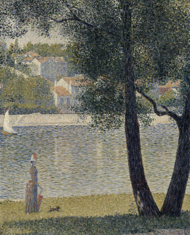
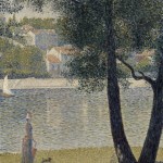
Georges Seurat, ‘The Seine at Courbevoie’, 1885 (La Seine à Courbevoie). Oil on canvas, 81.4 x 65.2 cm. Private collection, Paris
Radiance: The Neo-Impressionists. National Gallery of Victoria, 16 November 2020 – 17 March 2021
Impressionism was killed by theory, the theory that gave the Neo-impressionists their identity. Neo-Impressionist theory picked up on Impressionism’s naturalism and acute observation of outdoor light effects (coloured shadows and so forth) and married them to contemporary colour theory. The result was a pseudo-scientific artistic practice that proved to have interesting artistic possibilities wholly at odds with the theory that underpinned it.
The science was the idea of optical mixing of colours and the theory of complementary contrasts. These were set out by in a book published forty years earlier by Michele-Eugène Chevreul, who had been director of the Gobelins tapestry works. Optical mixing derived from the practice of tapestry workers of twisting differently coloured threads together to produce intermediate colours unpolluted by the admixture of black. In Neo-Impressionist practice this did not work, as the dots are always too visible to optically mix, but it did suggest a way of painting with patches of pure hue diluted with white in various degrees but not with black, resulting in an overall high key without muddiness, but which lacked the sparkle of much early Impressionist painting. This sparkle is found in the early works of Monet in particular, which relied on strong tonal contrasts and saturated colours: water in early Monet has strokes of black, white, and everything in between (Fig. 1).
This resulted in a generally cool, high key tonality that requires equally neutral walls (but not white) for the pictures to read effectively: the opposite of Caravaggesque chiaroscuro which demands dark red walls. This is what we find in this exhibition, where the overall effect is nothing if not tastefully bland, directing us to focus on the chromatic harmonies in the works, which are often very subtle. In fact it reminds me of the super-subtle hang of the Whistlers in the Freer Gallery in Washington, where the play of pale greys within the paintings against the pale walls is crucial to the overall effect.
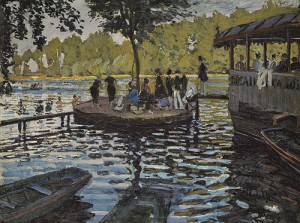
Fig. 1. Claude Monet (French, 1840–1926), La Grenouillère, 1869. Oil on canvas, 74.6 x 99.7 cm. New York, Metropolitan Museum, H. O. Havemeyer Collection, Bequest of Mrs. H. O. Havemeyer, 1929 (29.100.112).
The theory of complementary contrasts is a physiological phenomenon concerning the human perception of boundaries. When an area of colour has a boundary with another area of colour, it will induce its complementary colour on the other side of the boundary. This means that if you put a blue field against an orange one along the junction the blue will be bluer and the orange more orange. In monochrome, a black area beside a white one will have the same effect. Theoretically, if applied to painting, this will produce a more intense colour effect, and so help painting to escape from the limitations of pigments that cannot match the scale of intensity of natural light. The English gardener Gertrude Jekyll, who was much influenced by Neo-Impressionist ideas, commented on the intensifying effect of complementary contrasts when viewing a red flower against green foliage. But she was looking at a real garden, not a painted one. In a painting it ought to be sufficient to juxtapose coloured fields and the eye will do the rest, but the Neo-Impressionists chose to turn this fact into a diagram of the theory, or a formula, whereby there are intensified tonal or complementary colour contrasts at every boundary, forming a kind of halo around objects. And because their theory was a theory of boundaries, their pictures are implicitly linear in a way that Impressionist pictures were not. Inside many Neo-Impressionist paintings there is a drawing by Ingres (or perhaps Puvis de Chavannes) trying to escape.
By confining their technique to the application of pure or whitened pigments to a white ground, the Neo-Impressionists ended up with a way of painting that denied the illusionistic delights of painting of an earlier era. Neo-Impressionism erases all distinctions between materials: the copperiness of copper in Chardin, the sheen and touch of satin in Berchem, the rotting wood of Constable, the luminosity of the sky in Claude Lorrain. Everything is reduced to the same texture, leaving only the design. This design, as we have seen, is implicitly linear, or else could be provided by a photograph, a medium that is already half-way down the path towards the suppression of the thingness of things. I remember being approached by a professor in one of the computer sciences about the exciting possibility of developing digital filters to turn a photo into a Van Gogh, an appalling idea from an art historical perspective but one that has wide appeal to judge from the number of ‘artistic’ filters in Photoshop or in Instagram. Quite a few paintings in this exhibition could have been produced in this way, as they look like photographs seen through a screen of coloured dots, a ‘Neo-Impressionism filter’.
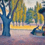
Paradoxically, then, Neo-Impressionist pictures, in spite of the pseudo-science of their pointillism, stand or fall on the strength of their design, and the colouristic complement to this, their colour harmonies. This is where Seurat had it all over his colleagues and followers. The outstanding picture in the exhibition, and the first one you see as you enter, is Seurat’s The Seine at Courbevoie (1885) (Fig. 2). Because of their technique, and because they had had no interest in the botany and geology that had sustained Ruskin or the Germans, the trunks, branches and leaves of the trees of the Neo-Impressionists are devoid of material presence. Only their shape remains. This was a disaster for a painter like Paul Signac, who took Neo-Impressionist theory too seriously and had no sense of design. The tree in his Saint-Tropez, Fontaine des Lices (1895) (Fig. 3) is a rubbery, blue, tentacled triffid, neither rooted in the ground nor forming a pleasing design on the surface. Seurat’s tree, by contrast, is exquisite: look at the way the two trunks form a V as they emerge from the ground part; the way the two diagonal branches are almost, but not quite, at the same angle; and the way these branches are variations on an angular theme, the lower one connecting the two trunks, with a step in the middle like the Big Dipper, and a prong like something in Gaspard Dughet. Seurat even manages to handle the foliage successfully, something that defeated Signac and most modernist painters. The Baroque convention was to construct a series of highlit masses, sometimes in combination with a two-dimensional screen of dots, arcs or other simple brush strokes. Seurat dispenses with mass and goes for the decorative screen, using brushstrokes like the stars you get in you eyes after looking at bright lights. There is variation in the density of these starburst strokes that hint as the massing of the foliage, but these are only hints. It is essentially a decorative screen, which harmonises beautifully with the buildings beyond, which in spite of their geometry read as pattern rather than being disruptively Cubist. This is beautifully contrived, wholly about design, and not at all about perception.
Also beautifully contrived is the almost exact division of the canvas in two by the far river bank, which is not quite horizontal. That this not-quite-horizontality is deliberate is confirmed by the bands of light and dark in the foreground: a little band of light with Seurat’s signature in the bottom right corner signals that the slight tipping up of the right side is deliberate. Any photographer trying to extract a strong design from a scene like this would work hard—with a little help from Photoshop if required—to get the horizontals truly horizontal, since that it what distinguishes an artful photograph from a random snapshot. In a painting constructed from the ground up, however, too strict a geometry looks mechanical, as Seurat well knew. With the accents on the left side, however, Seurat displays the compositional heavy-handedness that disfigures his more elaborate works. The woman with parasol and bustle and dog, familiar from the La Grande Jatte, is a little too obviously a Seurat formula, shouting: look at my shape! How weirdly stylish it is! Then there is the boat with the white sail: yes we do need an accent here (or do we—it seems to work quite well if you imagine it away; one can imagine Seurat agonising over this).
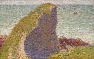
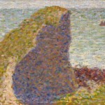
Fig. 4. Georges Seurat (French 1859–91), Study for The Bec du Hoc, Grandcamp 1885 (Étude pour Le Bec du Hoc. Grandcamp). Oil on wood panel, 15.6 x 24.5 cm. National Gallery of Australia, Canberra. Purchased from proceeds of The Great Impressionists exhibition 1984 (84.1933).
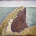
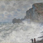
Seurat’s mix of great subtlety with a certain compositional obviousness is vividly revealed in the two versions of Le Bec du Hoc, Grandcamp, a preparatory study (Fig. 4) and the finished work (Fig. 5). We can see what Seurat it trying to do here: this rocky headland is a strange shape, like the woman with the bustle; he has discovered on in this coastline something quite different from Monet, who in similar circumstances (such as his Rough Weather at Étretat (1883) in the NGV, Fig. 6, not in the exhibition) tried to capture wind, waves and spray. The study (Fig. 4) is exquisite: less than a third the size of the finished work, but executed in similar-sized strokes, it has—dare I say it—an impressionistic furriness about it, which in the big version is reduced to a mechanical screen of dots. There is a tiny strip of sky at the top which coincides—but-not-quite—with the top of the cliff, a relationship that is quite inspired: try shifting it in your mind’s eye and you will see what I mean. Then there are the two little triangles in the sea to the right, which look at first like rocks but prove to be sails. These are needed here to establish a spatial relationship between near and far to sustain the claims of space against surface, as well as to provide an accent to enliven a composition that may be too simple for comfort.
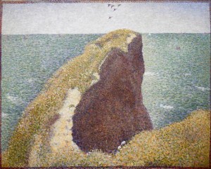
Fig. 5. Georges Seurat (French 1859–91), The Bec du Hoc, Grandcamp 1885 (Le Bec du Hoc, Grandcamp). Oil on canvas 64.8 x 81.6 cm. Tate, London Purchased 1952 (N06067) © Tate, London 2012.
But in working this up in the finished painting, Seurat loses much of what is most inspired in the study (Fig. 5). The band of sky has been enlarged, and the two triangular sails reduced, while the horizon–top of cliff relationship has been sharpened up. The sky is now a dead zone, so Seurat, with a heavy hand, inserts a flock of birds to give it life. An additional pair of sails, now white, near the tip of the cliff work rather better. The flecks of white in the water, barely discernible in the study, are now like the blotches of leprosy, as are the newly prominent sandy parts of the cliff. For some reason the reddish band—presumably the beach—has been removed. The composition is now essentially linear, reduced to the tight contours of the edges of the cliff and a hard horizon line, filled in with decorative dots and dashes. The changes are all in the wrong direction. Seurat’s besetting sin was that he overworked things, losing in the process his instinctive grasp of design.
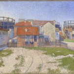
But at least Seurat understood that the point of his paintings was their design. Signac’s Gasometers at Clichy (1886) (Fig. 7) from the NGV, we learn, was his first Neo-Impressionist work. I have always disliked this painting, and seeing it alongside the Seurat makes me realize why. The design is awful. There are basically three bands; a sky where nothing much happens, a shambles of discordant architectural forms across the middle, and a dull foreground with uncomfortable perspectival effects at the left. The colour is pleasant enough, with that softness that results from the application of Neo-Impressionist technique, but this does not compensate for its compositional weakness.
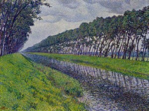
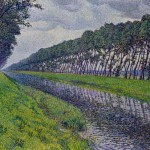
Fig. 8. Théo Van Rysselberghe (Belgian 1862–1926, worked in France 1897–1926), Canal in Flanders, gloomy weather (1894) (Le Canal en Flandre par temps triste). Oil on canvas, 60.0 x 80.0 cm. Private collection.
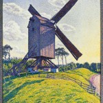
If we forget about Neo-Impressionisms theoretical aspirations, and go in search of what the style does best—line-based compositions purified of a sense of material by a screen of dots—the most inspiring pictures prove to be not by Signac, Cross or Luce, the names most closely associated with Seurat, but by Theo van Rysselberghe. His Canal in Flanders, Gloomy Weather (1894) (Fig. 8) is a wonderful composition. An Impressionist would not allow that baroque perspective to take charge in this way; but neither does van Rysselberghe surrender to the insistent regularity implicit in Dutch canals or French Baroque gardens. He picks up on the startling lean of the trees, which must be a naturalistic feature brought about by the prevailing winds, since the reflections lean the other way. These leaning trees combined with the insistent perspective create a curious torsion, as if one is tunnelling through to the vanishing point. But, as with Seurat, there is enough asymmetry and irregularity to keep things interesting—especially the reedy section that breaks up the line of the bank, which would otherwise be too regular. Van Rysselberghe avoids the laboured self-consciousness of Seurat’s compositions, but his painting does not wholly escape being a photograph with the Photoshop ‘Neo-Impressionism’ filter applied, like Calf Mill in Knokke (1894) (Fig. 9).
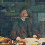
What makes van Rysselberghe interesting is that, being a little more distant from the movement than Signac, he could more easily exploit its potential for picture-making without being too dogmatic. His portrait of Émile Verhaeren in his Study (Fig. 10) is better designed than the comparative photo of the sitter illustrated in the catalogue, but it still looks just like a digital photo taken in low light with a lot of noise. In what is essentially a tonal painting, van Rysselberghe uses his dots to good effect, not to intensify a naturalistic effect of light, but to bring colour and luminosity into the shadows. Curiously, the most intriguing feature of the painting is the most illusionistic: they way the lenses of his pince-nez reflect the light while allowing us to see the eyes behind. As we have seen, the Neo-Impressionist technique generally served to suppress such effects. As if to make this point, the artist makes the sitter’s whiskers blend into the dots of the background, thus pointedly erasing any difference of substance.
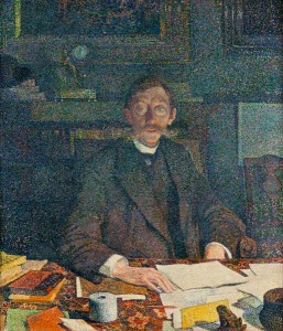
Fig. 10. Théo Van Rysselberghe (Belgian 1862–1926, worked in France 1897–1926), Émile Verhaeren in his study (Rue du Moulin) (1892) (Émile Verhaeren dans son cabinet de travail (rue du Moulin)). Oil on canvas, 86.0 x 75.6 cm, Royal Collection, Belgium Loaned to the Archives et Musée de la Littérature, Brussels.
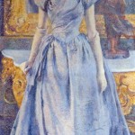
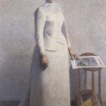
Portraits are not what we associate with Neo-Impressionism, and the interesting collection of other portraits in the same room help to explain why. Because Neo-Impressionism, unlike Impressionism, was applied to an underlying tonal structure, it was possible for this structure to become more assertive and volumetric at the expense of the coloured dots. This is what we see happening on the long wall. Van Rysselberghe’s Portrait of Alice Sèthe (1888) (Fig. 11), even more that his Verhaeren, is a tonal painting built from dots, especially when seen from a distance. The sitter seems unhappy to have been forced by the artist to stand against a Rococo console table in order to allow the painter to make homage to Ingres and Manet by including an impossible reflection of the back of her head in the mirror. Beside it is Achille Laugé’s Portrait of Madame Astre as a Milk Bottle (Fig. 12), where the forms of the body, which Seurat would have rendered as a silhouette, are here completely volumetric. The shift from the simplified emptiness of the rest of the painting to the more realistically modelled head is almost Klimt-like. Strangest of all is the way the dots of her bodice merge with the dots of the wall. Is this like Verhaeren’s moustache? Is it a pointillist take on Velázquez’s subtle play of figure and neutral background? Is it an over-subtle rendering of some change in the garment? Or has it been repainted with unintended consequences? By the time Laugé painted his By the Window in 1899 (Fig. 13) his pointillism had become irrelevant: in its high-keyed tonal modelling and simplified forms it could be by Hopper or some 1920s neoclassicist: the dots are almost invisible even at close range.
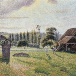
The most surprising Neo-Impressionist in the exhibition turns out to be Camille Pissarro. I remember seeing the Pissarro exhibition in Sydney a few years ago, and the impression I received was of a laboured and somewhat monotonous painter. Yet situated here amongst the Neo-Impressionists he proves to be much more interesting. It is refreshing to see an interest in light (as opposed to silhouette), lacking in the other Neo-Impressionists in the Delafolie Brickworks at Éragny (Fig. 14), which is a legacy of his Impressionism. The Flock of Sheep, Éragny sur Epte (Fig. 15) shows an interest in design worthy of Seurat, combined with an Impressionist interest in atmospheric effects, in this case a cloud of dust raised by the flock of sheep. The way the formlessness of the dust cloud blends almost imperceptibly with the sky demonstrates the possibilities of the Neo-Impressionist technique of treating all materials alike as spots of colour that can be brought closer and closer together in subtle colouristic relationships—Verhaeren’s moustache again. The play between this and the strength, even rigidity, of the geometric design gives this painting its interest, combined with the delightful task of masking sense of an image that at first sight is unintelligible.
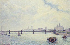
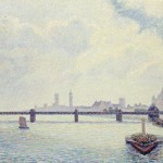
Fig. 16. Camille Pissarro (Danish/French 1830–1903), Charing Cross Bridge, London 1890 (Pont du Charing Cross, Londres). Oil on canvas 60.0 x 90.0 cm. National Gallery of Art, Washington Collection of Mr and Mrs Paul Mellon 1985 (1985.64.32).
Pissarro’s Charing Cross Bridge (Fig. 16) is another surprise. On one level he is doing a Seurat: the subtle yet obvious device of the long horizontal of the bridge, and the contrast between the speckled ‘shadowed’ bridge and the rest, as well as the contrived placement of the boats at left. But this is taken to another level by the wedge of the bow of the steamer at the right, and its more distant companion. This disrupts the Seurat-like planarity with the perspectival thrust of van Rysselberghe’s canal. And the orange and purple reflections in the water have more impressionist sparkle than Neo-Impressionist blandness. Pissarro’s years as an impressionist have given him a depth of artistic response that the certified Neo-Impressionists lacked.
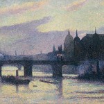
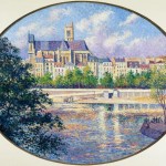
The more routine of these is Maximilien Luce. His View of London (Cannon Street) (Fig. 17) tackles the same project as Pissarro, and, of course, Seurat, but the effect is largely decorative: dark bridge against lighter skyline, with some rather confused boat-interest in the foreground (although the sky is interesting.) The two ovals of the Quai de Montebello (Fig. 18) and St Gervais Church (Fig. 19) tackle the baroque landscape challenge of the tripartite division of the round or oval landscape divided into water, land and sky, but the effect is a cross between a chocolate box and a micromosaic.
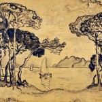
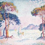
The later work of hard-core Neo-Impressionists like Signac goes in the opposite direction to Laugé in that the dots become bigger and brighter ‘constitutive’ dashes, and the structure more overtly linear. This is brought out clearly by Signac’s wash drawing and painting of Juan-les-Pins. Evening. The drawing (Fig. 20) shows how schematic the shading and highlighting of boundaries could become, as in the treatment of the sail of the sailing boat and the mountains beyond. Signac addresses the problem of foliage by employing a graphic formula consisting of broken parallel lines for branches (derived from Cézanne) and broken arcs for foliage that are rather like the series of 33’s attributed by Matisse to Claude Lorrain. The painting (Fig. 21) colourises the drawing, using large rectangular brushstrokes applied in arbitrary ways: those in the sky are vertical while those in the water are horizontal. We have come a long way from the empirical directions of the Impressionist brushstroke, or the Photoshop-filter uniform screen of dots of van Rysselburgh. This style consisting of large exaggerated colour spots and wavy lines had been developed earlier by Signac than this late example, and had been taken up by Matisse in his Luxe, Calme e Volupté of 1904, which marks the end of the line for Neo-Impressionism. More fun was to be had by dispensing with the dots and going for brightly coloured areas, and Fauvism was born.
The catalogue draws out the themes that structure the hang of the exhibition: Seurat, Signac and Neo-Impressionism, Early Neo-Impressionism, Neo-Impressionism and the City; the Lure of the Sea; Anarchy’s Arcadia: the Neo-Impressionist Landscape; Neo-Impressionist Portraiture; and Late Neo-Impressionism. The curators are Marina Ferretti Bocquillon of the Musée des Impressionismes, Giverny, who wrote the first essay, and Ted Gott and Elisabeth Cross of the NGV, who share the rest. Some of these themes—such as the essay on Anarchism—draw out the political significance of the choices of subject, which tend to escape the casual visitor to the exhibition (although Anarchism as a movement seems to be growing, to judge from recent news reports) but which has been a major preoccupation of recent scholarly work. This is a must-see exhibition, with lots of interesting paintings not often seen or published. The NGV has done a wonderful job in providing a rich and regular series of exhibitions in recent years, filled with works of real interest and variety for those who like to linger over their works of art. Long may they continue.
© David R. Marshall 2012
See the images discussed in this review below – there is also a full image gallery of the exhibition on the NGV website here.
- Fig. 1. Claude Monet (French, 1840–1926), La Grenouillère, 1869. Oil on canvas, 74.6 x 99.7 cm. New York, Metropolitan Museum, H. O. Havemeyer Collection, Bequest of Mrs. H. O. Havemeyer, 1929 (29.100.112).
- Georges Seurat, ‘The Seine at Courbevoie’, 1885 (La Seine à Courbevoie). Oil on canvas, 81.4 x 65.2 cm. Private collection, Paris
- Fig. 3. Paul Signac (French 1863–1935), Saint-Tropez. Fontaine des Lices, 1895. Oil on canvas 65.0 x 81.0 cm. Private collection.
- Fig. 4. Georges Seurat (French 1859–91), Study for The Bec du Hoc, Grandcamp 1885 (Étude pour Le Bec du Hoc. Grandcamp). Oil on wood panel, 15.6 x 24.5 cm. National Gallery of Australia, Canberra. Purchased from proceeds of The Great Impressionists exhibition 1984 (84.1933).
- Fig. 5. Georges Seurat (French 1859–91), The Bec du Hoc, Grandcamp 1885 (Le Bec du Hoc, Grandcamp). Oil on canvas 64.8 x 81.6 cm. Tate, London Purchased 1952 (N06067) © Tate, London 2012.
- Fig. 6. Claude Monet, Rough weather at Étretat (Gros Temps à Étretat) 1883. Oil on canvas 65.0 x 81.0 cm. National Gallery of Victoria, Melbourne Felton Bequest, 1913, 582-2.
- Fig. 7. Paul Signac, Gasometers at Clichy 1886 (Les Gazomètres. Clichy). Oil on canvas 65.0 x 81.0 cm. National Gallery of Victoria, Melbourne Felton Bequest, 1948 1817-4.
- Fig. 8. Théo Van Rysselberghe (Belgian 1862–1926, worked in France 1897–1926), Canal in Flanders, gloomy weather (1894) (Le Canal en Flandre par temps triste). Oil on canvas, 60.0 x 80.0 cm. Private collection.
- Fig. 9. Théo Van Rysselberghe (Belgian 1862–1926, worked in France 1897–1926), Calf Mill in Knokke (Windmill in Flanders) (1894) (Le Moulin du Kalf à Knokke (Moulin en Flandre)). Oil on canvas, 80.0 x 68.5 cm. Private collection.
- Fig. 10. Théo Van Rysselberghe (Belgian 1862–1926, worked in France 1897–1926), Émile Verhaeren in his study (Rue du Moulin) (1892) (Émile Verhaeren dans son cabinet de travail (rue du Moulin)). Oil on canvas, 86.0 x 75.6 cm, Royal Collection, Belgium Loaned to the Archives et Musée de la Littérature, Brussels.
- Fig. 11. Théo Van Rysselberghe (Belgian 1862–1926, worked in France 1897–1926), Portrait of Alice Sèthe 1888 (Portrait d’Alice Sèthe). Oil on canvas, 194.0 x 96.5 cm. Musée Départemental Maurice Denis – Le Prieuré, Saint-Germain-en-Laye Purchased 1978 © Studio Lourmel, Photo Routhier.
- Fig 12. Achille Laugé (French 1861–1944), Portrait of Madame Astre 1892 (Portrait de Madame Astre). Oil on canvas, 198.0 x 133.0 cm. Musée des Beaux-Arts, Carcassonne. Gift of the artist, 1939 (939.5.685) © Achille Laugé/ADAGP. Licensed by VISCOPY, Sydney.
- Fig. 13. Achille Laugé (French 1861–1944), By the window 1899 (Devant la fenêtre). Oil on canvas, 123.0 x 150.0 cm. Musée de Petit Palais, Geneva Ghez collection (12856) © Achille Laugé/ADAGP. Licensed by VISCOPY, Sydney
- Fig. 14. Camille Pissarro (Danish/French 1830–1903), Delafolie Brickworks at Éragny 1886 (Briqueterie Delafolie à Éragny). Oil on canvas, 57.8 x 71.8 cm. Private collection.
- Fig. 15. Camille Pissarro (Danish/French 1830–1903), Flock of sheep, Éragny sur Épte 1888 (Troupeau de moutons, Éragny sur Épte). Oil on canvas, 46.2 x 55.2 cm. Private collection.
- Fig. 16. Camille Pissarro (Danish/French 1830–1903), Charing Cross Bridge, London 1890 (Pont du Charing Cross, Londres). Oil on canvas 60.0 x 90.0 cm. National Gallery of Art, Washington Collection of Mr and Mrs Paul Mellon 1985 (1985.64.32).
- Fig. 17. Maximilien Luce (French 1858–1941), View of London (Cannon Street) (1893) (Vue de Londres (Cannon Street)). Oil on canvas 65.0 x 81.0 cm. Private collection.
- Fig. 18. Maximilien Luce (French 1858–1941), The Quai de Montebello and Sainte-Geneviève Hill 1901 (Le Quai de Montebello et la colline Saint Geneviève). Oil on canvas, 66.0 x 80.7 cm. Private collection.
- Fig. 19. Maximilien Luce (French 1858–1941), St Gervais Church, view of the Seine 1901 (L’Eglise de St Gervais, vue de Seine) oil on canvas 66.0 x 80.7 cm Private collection.
- Fig. 20. Paul Signac (French 1863–1935), Juan-les-Pins. Evening (1914) (Juan-les-Pins. Soir) ink wash 72.3 x 90.1 cm Private collection.
- Fig. 21. Paul Signac (French 1863–1935), Juan-les-Pins. Evening (first version) 1914 (Juan-les-Pins. Soir (première version)). Oil on canvas, 73.0 x 92.0 cm. Private collection.

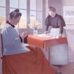


We had a long discussion in front of Cross’s ‘By the Window’, about what the second woman (is she a servant?) is doing? Cutting material with a knife? or is it a bird she’s cutting, or an animal skin? I wonder if there is any information on it. I know the subject shouldn’t matter as much as the style, but you can’t help wondering. Virginia
Hi David,
This is a fantastic article, I loved reading it as I did happen to go to the exhibition myself. it is fantastic to see someone write up such a detailed review. The paintings were amazing and the skill involved was unbelievable. I also wrote a post on the Exhibition if you would like to get another persons perspective of the Neo Impressionists.
http://www.sarapaxtonartworks.com/neo-impressionists-exhibition/
Thanks,
Sara